Evolving a brand.
When White Giraffe was introduced to Sentient Science they were in the process of transitioning from an engineering R&D company to conducting commercial enterprise level sales within the Industrial equipment market. As the company has evolved they needed the brand to evolve with them.
Company Brand
The initial change was promoted by the change in the company direction to a software company. The goal was to create a logo that was versatile and felt like that of a software companies.
As the company evolved as well as the software product there was a disparity between the company brand and the product brand the last iteration was to apply the accessibility learning that drove the product design decisions and to incorporate that into the company brand.
Product Brand
The product has a different name from the company. To keep continuity between company and product marketing we unified the brand with the use of fonts and colors. Additionally the word-mark for the product emphasizes the product name and provides the communication flexibility to target a specific customer/user group with the “for” text.
Standardize and scale the design and development process.
In the beginning, there was no visual unity between brand, marketing, and product. Being a startup, there was little time to develop a proactive approach and guidelines to create that unity. As the company grew and the product suite started to scale, it was critical to put a tool in place to support and build a design community within Sentient Science. This design system empowered members outside of the design team, software engineers and marketing personnel, to come up with solutions that meet internal design standards and promote visual unity throughout the customer’s experience.


Know the user.
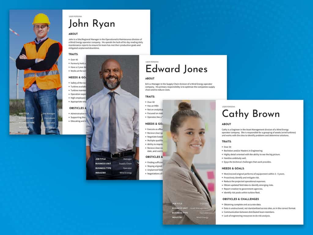
In order to empathize with your user and to be able to develop a product that solves a problem, you first need to know who they are. This is done through the creation and maintaining of user personas.
Regular user interviews were conducted of new clients and new departments within current clients to better understand the Goals and Challenges that our potential users faced on a regular basis within their work culture.
The result of every interview would be the updating of a currently existing user persona or the creation of a brand new one.
Finding customer pain points and creating business value.
A full review of research outlined below can be found on our blog.
Initiative
It was identified that the user found minimal to no value the first time they logged into the software product. This impression did not change until 3 to 4 months when the onboarding of the requested data was to a satisfactory state.
This lead to White Giraffe researching the onboard process from an internal and external view point. We wanted to better understand how the user interface (UI) could guide both internal and external users through the onboard process. Additionally, We wanted to determine if value could be added as steps of the onboard process were completed.
Results
The initial results revealed that there were many more potential users that where engaged and responsible for gathering data that than needed to be uploaded into the system. None of these user were engaged through the tool. The user flows below outlines a solution that alters how the internal customer support engaged the customer and how the customer engages with their internal resources. The key is this engagement takes place through the platform and not through email and phone calls.

Providing value by clearly communicating.
With each iteration of Sentient Sciences flag ship product, new things were learned. The common theme of these learning revolved around how the application communicated. User confusion would come in when new user personas, or new features, were introduced to the software.
For each iteration we focused on letting the user obtain the information they needed as quickly as possible and to clearly communicate the factors and their status that make up the failure prediction.
As we tested new iterations we consistently obtained System Usability Scale (SUS) score in the 80‘s and 90‘s for the intended user persona.
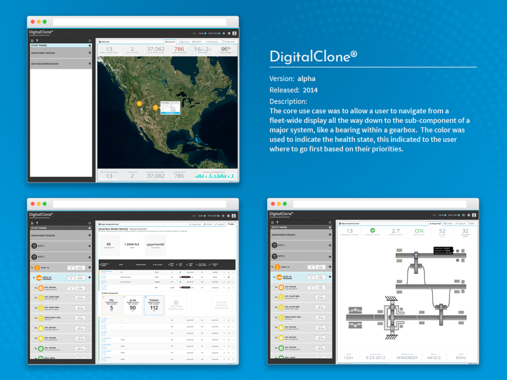
ALPHA version – 2014
The core use case was to allow a user to navigate from a fleet-wide display all the way down to the sub-component of a major system, like a bearing within a gearbox. The color was used to indicate the health state, this indicated to the user where to go first based on their priorities.
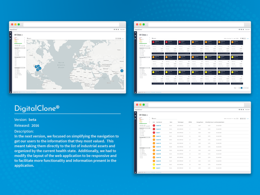
BETA version – 2016
In the next version, we focused on simplifying the navigation to get our users to the information that they most valued. This meant taking them directly to the list of industrial assets and organized by the current health state. Additionally, we had to modify the layout of the web application to be responsive and to facilitate more functionality and information present in the application.
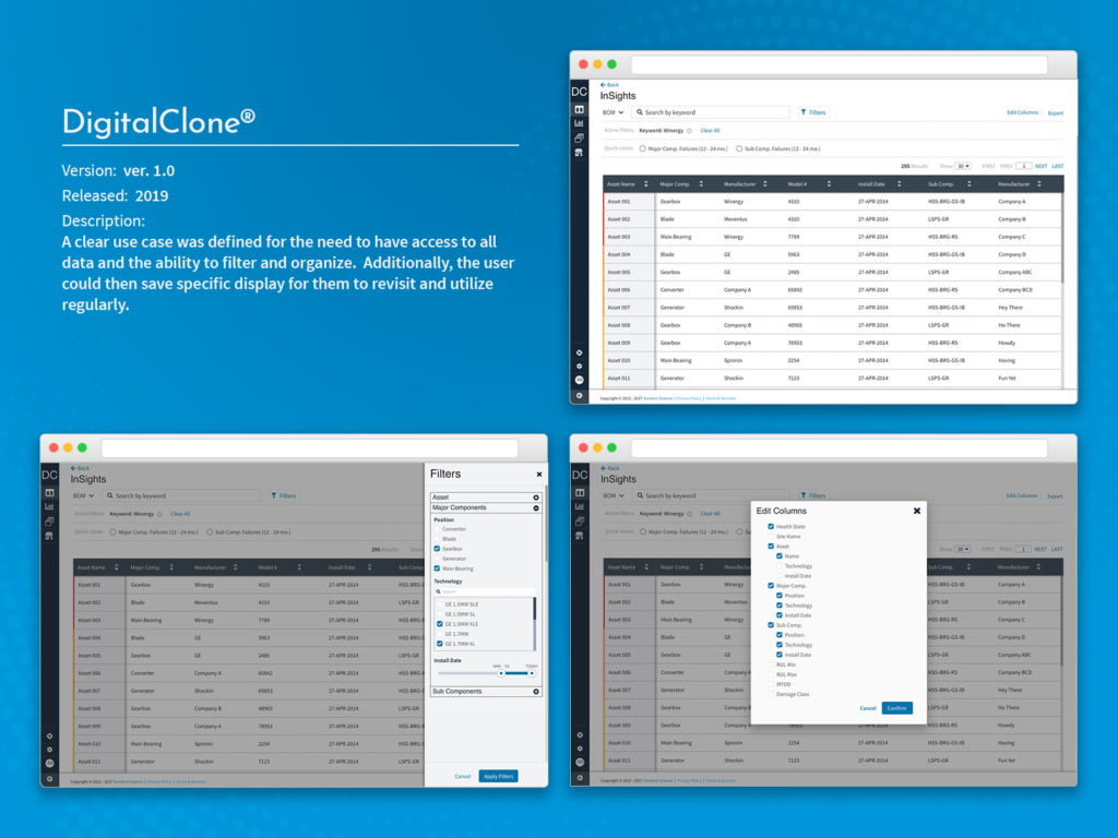
Version 1.0 – 2019
As we learned more about the user base and the demands of our prediction algorithms, it was clear that data accuracy was important. The application needed to communicate the status of the data and how that corresponded to the prediction that they were given. Additionally, the application needed to make more information available higher in the navigation architecture.
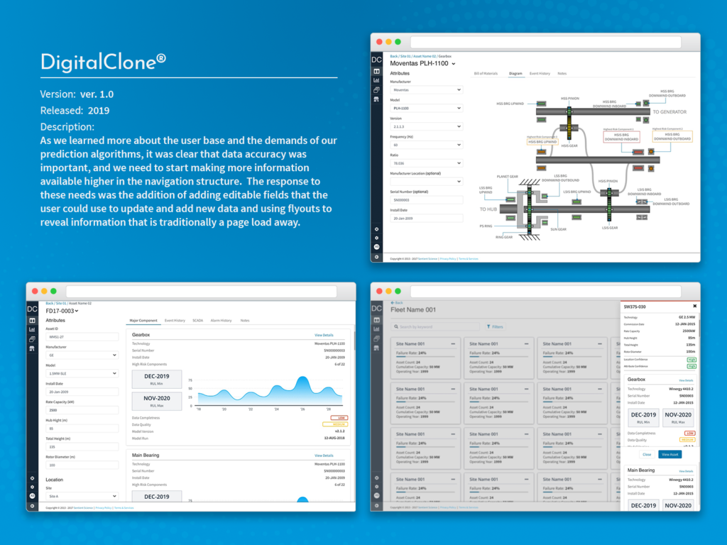
A clear use case was defined for the users need to have access to all data and the ability to filter and organize. Additionally, the user could then save specific display for them to revisit and utilize regularly.
Additional Functionality: Life Extension
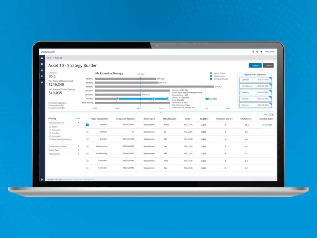
As the core DigitalClone product was displaying failure predictions, after learning this information the user then wanted to determine an optimized solution to push out that failure date. The solutions need to take into account the life added and the monetary value added to the entire asset. The initial solution attempted to allow users to identify high risk components and select and schedule maintenance actions to take. As selections are made, the user will see the left added to the turbine along with the monetary gain or lose from that action.
