Recently, I went through a design exercise to revamp our software’s main navigation (GUI Chrome) and to set guidelines for for our design system. This is what I learned from that experience.
How to think about the navigation for your enterprise software
In order to improve the navigation of the enterprise software, you need to transition your thought of navigation from being a simple component on the screen to it being an essential part of the GUI (Graphical User Interface) Chrome.
GUI Chrome is the visual design elements that give users information about or commands to operate on the screen’s content (as opposed to being part of that content). These design elements are provided by the underlying system — whether it be an operating system, a website, or an application — and surround the user’s data.
NN/g — Nielsen Norman Group
This transition of thinking allows you to focus on giving the user enough context to what navigation options they have. In addition, the UI design process will benefit from the clarity and guidance that this frame of mind provides.
The requirements of a successful UI Navigation (GUI Chrome) are:
- The navigation should be consistent across all platforms
- Should be able to facilitate multiple use cases.
- Should be clear to the user of what they are navigating to.
The Process
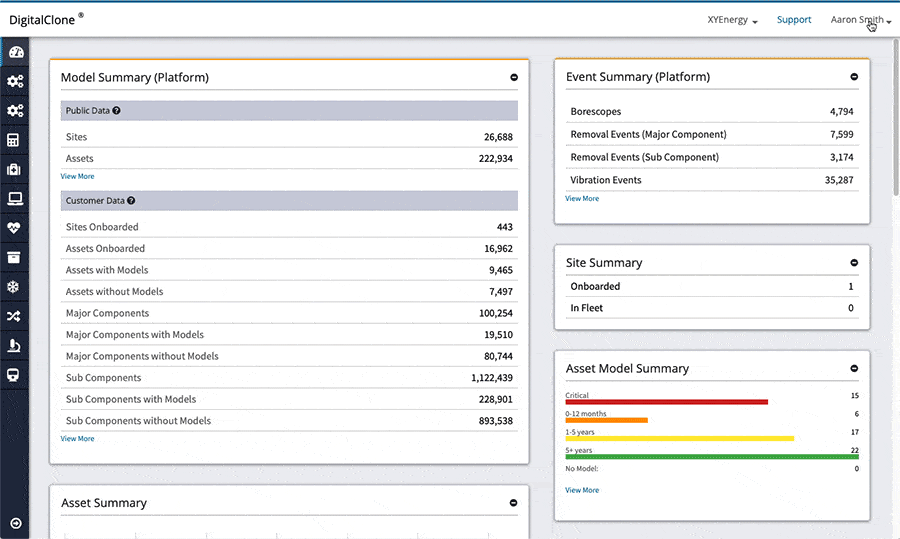
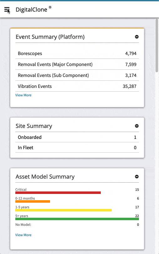
Through internal and external user feedback, it was clear that the main navigation of the current software product is not suitable. Through methods of user testing and click event tracking, it was determined that user was confused when trying to navigate around the application. This confusing was amplified for internal users who needed to navigate between different customer instances.
As you can see from the examples above, there is:
- a lack of cohesiveness from mobile to desktop displays.
- no context to the main navigation points through a dependency on icons and not using descriptive titles.
- no navigation points to the main functionality for mobile display users.
The Solution
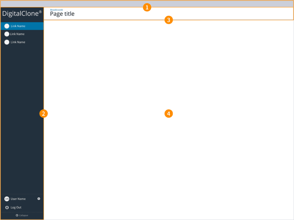
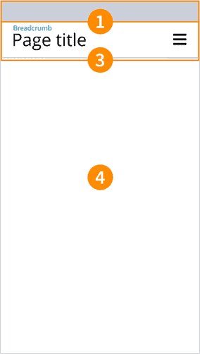
The result of the updated design for the application navigation, the following key sections were defined within the GUI Chrome:
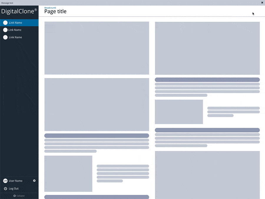
- Header: This defines the upper most part of the product. This section is displayed in order to notify users or to navigate to different data sets that would modify the content of the entire application.
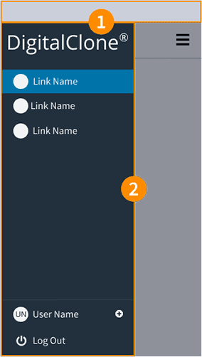
- Global Navigation or Sidebar: This will contain the product brand along with the main points of navigation.
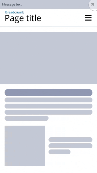
- Main Container — Page Header: This will contain breadcrumbs, page title, and action buttons that would modify the content within the main container.
- Main Container — Body: This is where the main content is located.
Desktop display requirements:
To achieve my goals, I created requirements for the design to communicate exactly what is expected from the updated UI navigation to hit the targeted goals.
- Header will only display under two conditions:
- If there are alert notifications that require the user to take action.
- If the user has the ability to change the global data set of the product (ex. customer displayed), a selector will appear.
- The Global Navigation is expanded by default on user login. This will give the user immediate context to what points of navigation are available.
- The link titles with in the Global Navigation are to be descriptive terms representing what action will be done by the user.
- If the user collapses the Global Navigation, the navigation names will appear via tooltip when the cursor is hovered over the supporting icon.
- When the Global Navigation is expanded, it pushes the Main Container which reduces the container width. As the Global Navigation is collapsed, the Main Container will expand in width. The Global Navigation should never overlap the content in the Main Container.
Mobile display requirements:
- The Global Navigation is now accessible by a hamburger menu icon that appears in the top right. Once clicked, the Global Navigation will fly out from the left. This way the navigation will overlay the Main Container. The Global Navigation will fly off the screen on click.
Results
Preliminary user testing demonstrates improvements in the user’s ability to navigate through out the software.
There was a great improvement for internal users to quickly and clearly navigate between the different customer instances. This minimized the confusion on what customer data they were navigating.
This is documented in more detail along within the Sentient Science Design System.
